Toy Swapper
UX Design /UI Design/Product Design
My Role
UX Designer/Product Designer
Timeline
2 months
Tools
Figma, Paper + Pencil, Google Forms, Google Meet, Miro
Stakeholders
Lee O’Connor
Overview
Children grow fast, and go through toys even faster!
The ToySwapper app helps parents save on the cost of buying new toys all the time by providing a platform on which to exchange toys with other parents.
This is not only an economically-friendly solution for families but an environmental one as well, as trading toys reduces the amount of plastic and wood used for new toys.
Challenge:
Design an app that helps parents trade used toys with other parents within the community, and beyond.
Deliverable:
Mobile app
Demographic:
25-45 year old parents nationwide
Competitive Analysis
I started my discovery phase by researching two toy trading apps (ToySwap and ToyTrader) that I found online, and finding the strengths and weaknesses in both.
Findings
My findings revealed that the direct competitors to my app are not well maintained apps that are easy to navigate and understand. They also don’t look like they are being used by many people.
This is a major opportunity for ToySwapper to improve the user experience in the toy sharing marketplace!
User Interviews
I conducted a Google Forms survey, to gauge the interest in a toy trading app and to see what features people would like. Here are my findings:
78% of the 23 respondants are interested in a toy sharing app.
The majority of them (87%) shop online and buy secondhand (65%) online.
There was enthusiasm about wanting to have a better environmental impact through buying secondhand (91%) and also cost was a factor in buying secondhand (81%).
User Personas
I followed up with 5 users from the survey in order to understand their needs more. Based on these interviews, I constructed two personas that would benefit from the ToySwapper App:
MVP Essentials
When considering the features of the ToySwapper app, I needed to focus on which features are essential to get my MVP shipped!
Here’s my final list:
User profile > includes user’s listings, user rating/reviews and user location.
Media Upload > Must be able to upload images
In-App messaging > Communication between users is critical for app to function.
Rating System > Important for users to rate others, to build trust amongst community and help keep item quality high (many people I interviewed were concerned about cleanliness of items)
Search tool > to quickly search for exactly what you’re looking for
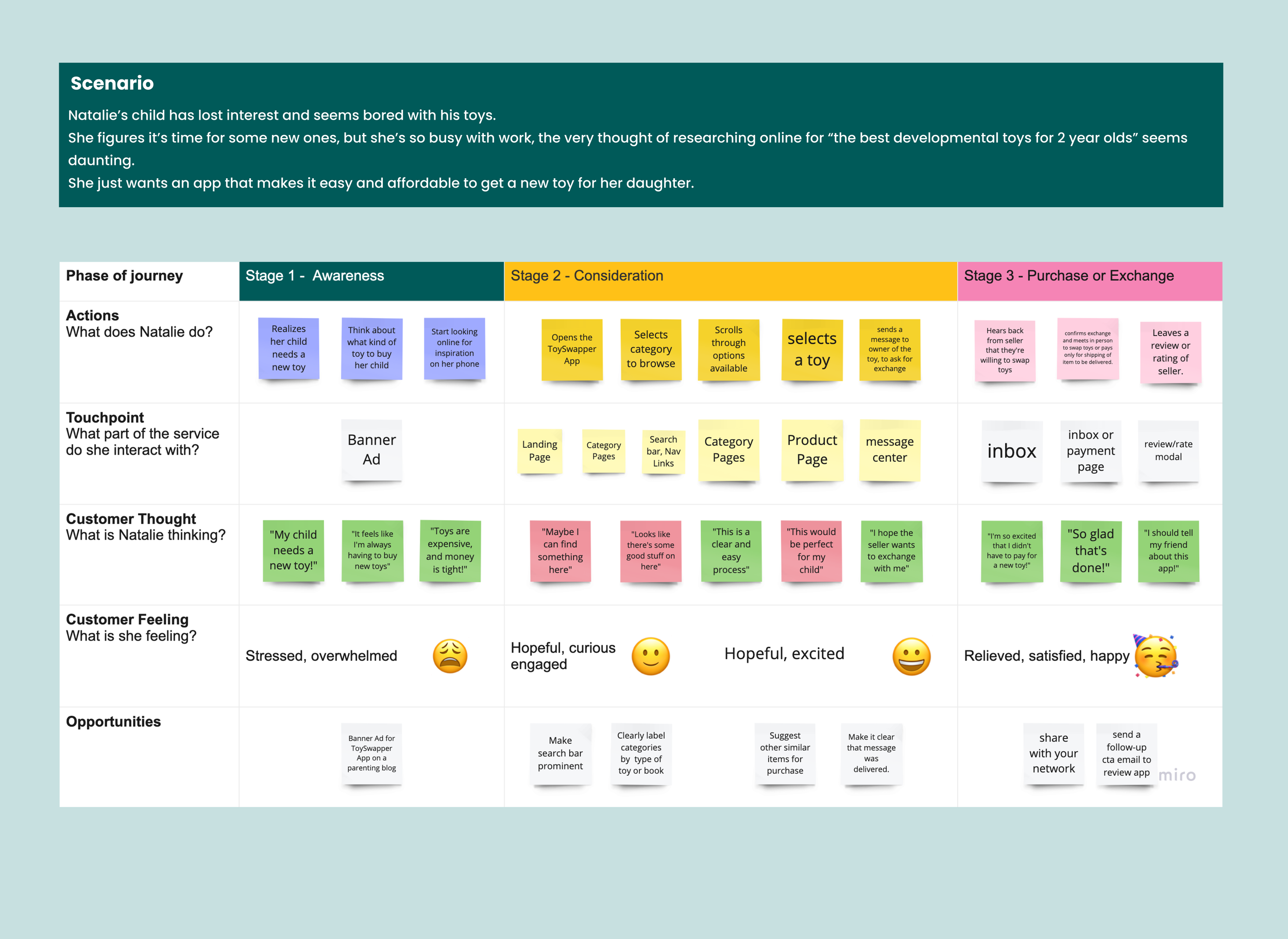
Natalie’s User Journey + User Flow
I wanted to figure out a typical scenario that would bring a user to try ToySwapper, and also wanted to see how they would complete the task of exchanging a toy with someone on the app.
I drew out a user flow and user journey for Natalie, one of the personas I created:
Using the userflow and MVP as a guide, I first sketched out paper + pencil wireframes to figure out the interface, then moved on to mid and high-fidelity wireframes in Figma.
I created a clickable prototype in Figma, for usability testing.
Test
I then conducted 5 remote moderated usability tests via Google Meet, and gave the following prompts:
You already have an account on ToySwapper. Proceed to login.
You see a rainbow puzzle that you’d like to swap one of your listings for.
Proceed to do so.
Findings
Although all of the users were able to navigate the “Request A Swap” flow easily, there were a few helpful suggestions that were mentioned along the way.
I rated these suggestions using Nielsen’s Severity Rating Scale, in order to prioritize what needed to be fixed for the MVP.
Final Mockups
I fixed some of the essential issues that were brought up during usability testing, such as creating a space on the user’s profile to store favorited items, as well as changed the heading on the email for meeting up in person from “Swap Request” to “Meetup Request”.
Below are some examples of the final screens for the app.
Style Guide
Typography
For the typography, I used the display typeface Bakbak One for the logo, because I felt its boxy lines mixed with rounded corners suited my custom alien/toy logo design.
For the rest of the text, I used Montserrat, for easy legibility.
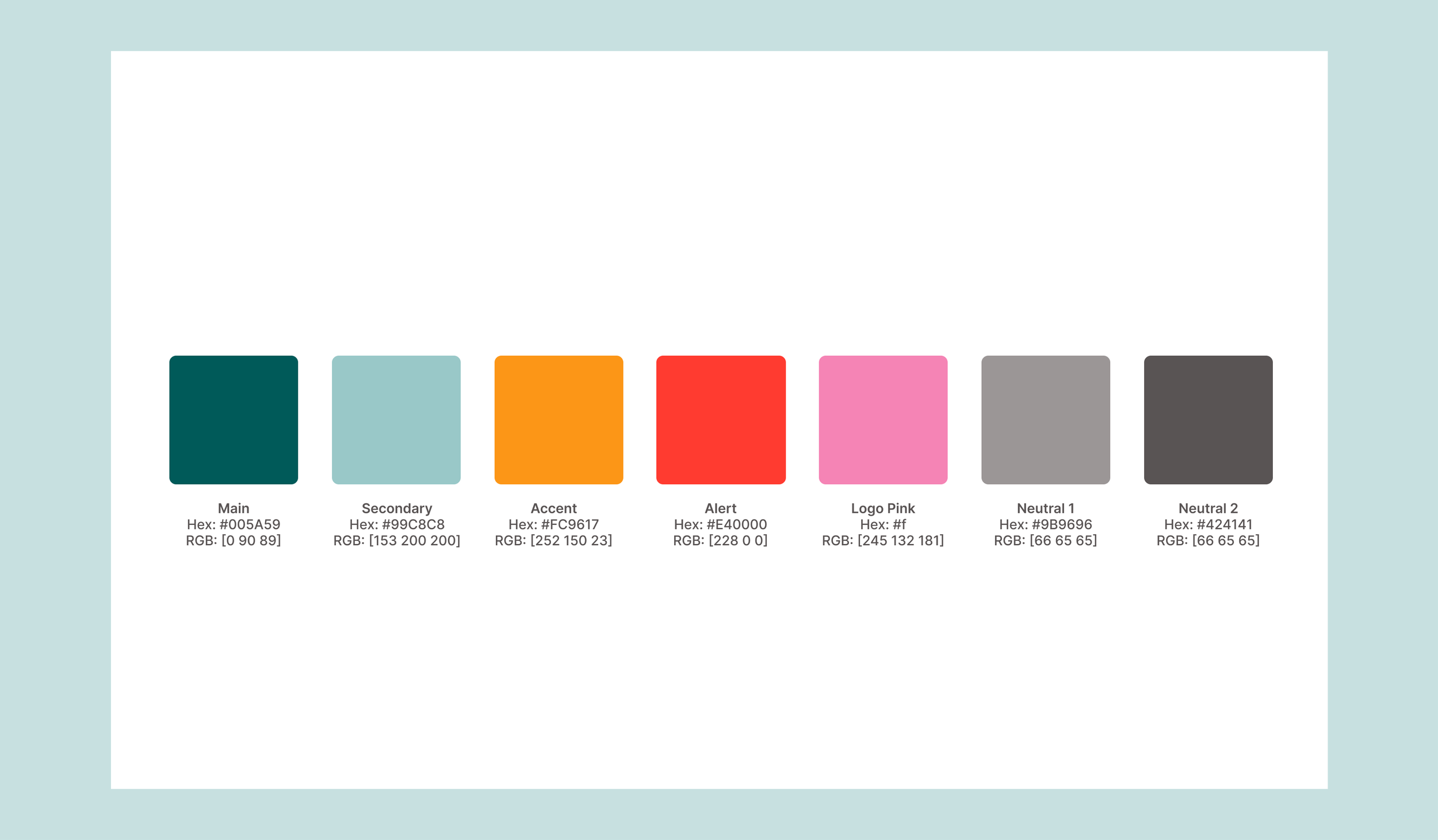
Colors
For the ToySwapper color palette, I chose a multicolor theme for the logo, because it’s an app that’s about kids’ toys, and I wanted it to be playful and fun. For the screens, I used a mix of blues that were approachable and friendly.
Logo + Icons
I made the custom ToySwapper logo in Figma. I wanted to create a playful character that was toylike and fun and gender-neutral.
For the icons, I used Boxicons - an open source icon set.
Reflections
This MVP is ready to ship. I think it solves some essential issues for parents who want to exchange toys in an easy and straightforward way without spending much to do so.
For future iterations, I will perhaps add a designated “Favorites” menu item, so the user doesn’t have to first visit their own profile to view saved/favorited items.
I learned a lot doing this project. It was my first time designing a mobile app and a user flow for it, and I grew much more confident using Figma. I learned that it’s always good to have another set of eyes (or more) when testing your user flow, because inevitably some things get overlooked.


