Amber Farms
UX/UI Feature Design

My Role
UX Designer
Timeline
2 Months
Tools
Figma, Paper + Pencil, Google Meet
Role
UX Designer
Overview
Amber Farms asked me to improve their internal ordering app by implementing new features that would streamline the ordering process for the clients and management.
Their main pain point was that their clients (local chefs) were contacting them via email and phone, instead of through the ordering app.
I created 3 features to address common pain points in the produce ordering experience:
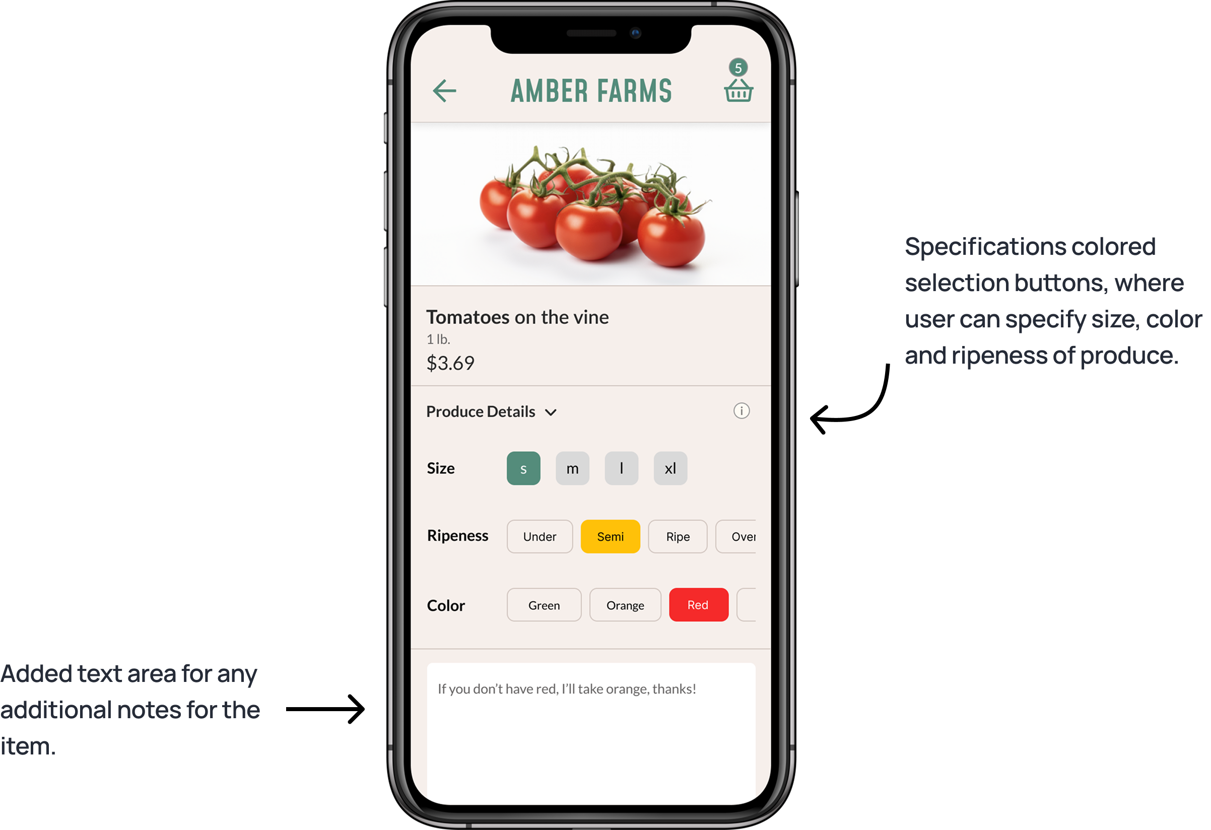
Produce Specification Selector: Enables chefs to customize their produce orders by selecting specific characteristics (e.g., ripeness, size, color).
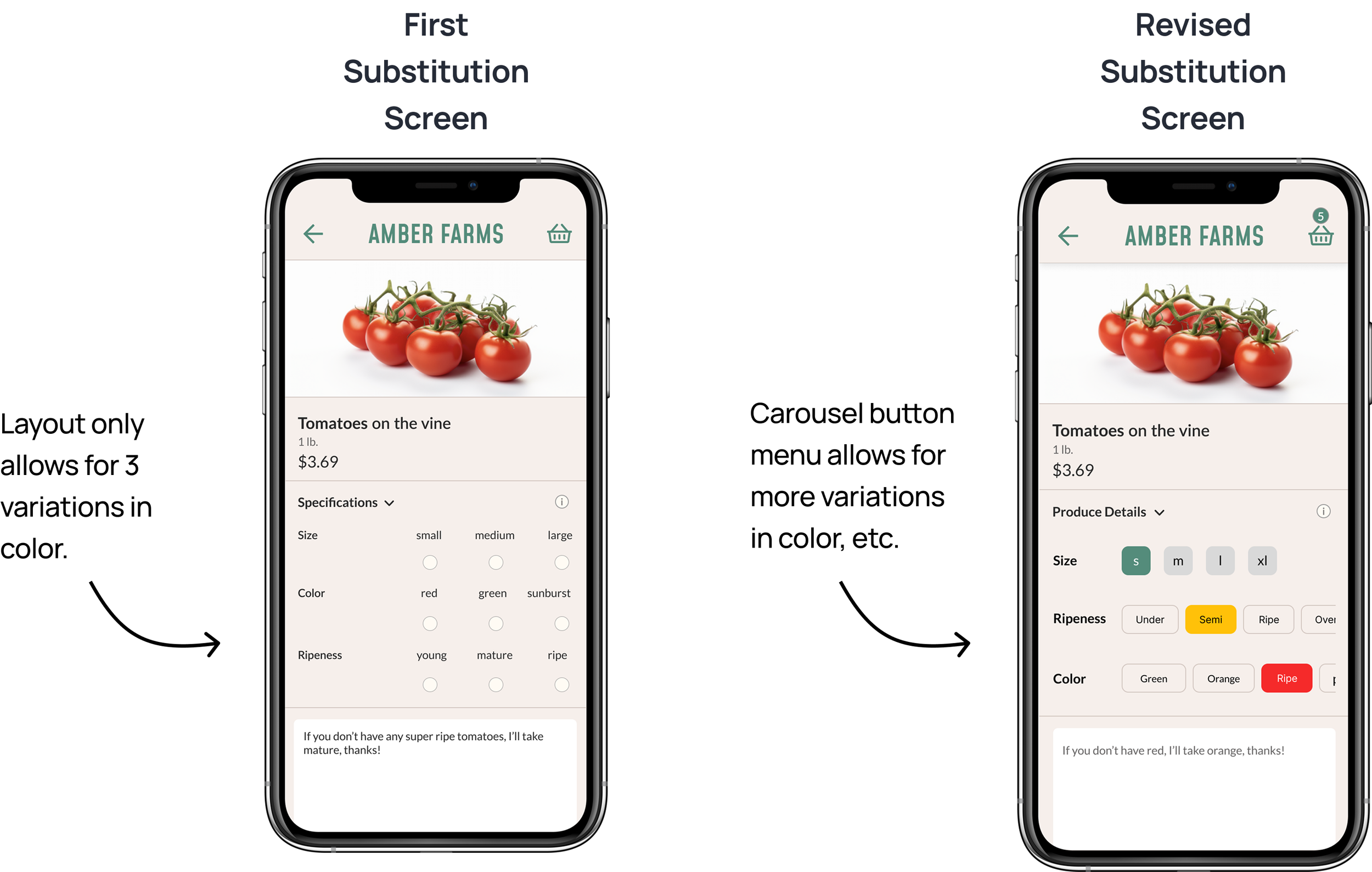
Smart Substitution: Automatically recommends similar items when a selected product is out of stock, reducing delays and manual re-selection.
Past Order Reordering: Lets users quickly reorder from previous purchases, with the flexibility to edit quantities or items before checkout.
How will improving the ordering process contribute
to business goals for Amber Farms?
Research Phase
Stakeholder Interview
Key Takeaways from stakeholder interview with Isabelle, the manager at Amber Farms:
She often worked overtime relaying requests to farmers, struggling with miscommunication and human error.
She is also having trouble answering numerous direct emails and texts from clients.
Synthesis of Business Goals

User Interviews / Mapping
I then read through the chefs’ emails to Isabelle, to better understand what type of requests they were making.
Then, I set up interviews with the users (6 local chefs) to better understand their pain points with the app.
I asked about their typical day, how they order with the app, and any pain points they encounter.
From the interviews, I created an affinity map and then distilled the findings down to 3 main themes: Timesaving, Specifics, Substitutions
Before initial sketching, I did some app research with Whole Foods, Instacart, and Doordash to explore how other grocery apps addressed ordering previous orders, specifying and substituting items.
Hi-Fi Wireframes


“
After comparing the data from Isabelle and the chefs,
I defined the action items for the new feature developments for the app:

Competitive Analysis
Here are 3 features + concepts that I began working on to support users’ needs:
Specification Feature on PDP
Substitution Feature on PDP
Previous Order Feature on Homepage
I then tested the prototype with a few of the chefs, to gather feedback on the design and functionality.
I received overlapping feedback on a few design elements, which I took into consideration and adjusted the design:
Specifications (color, for example) may need more than 3 options.
Substitutions screen should feature on sale items, that are similar to the item that’s out of stock.
Outcomes
Two months after launching the new design, I was able to gather the following metrics:
92% of the customers I surveyed rated the app update a 9 or 10 (10 being the most improved) when asked if their overall ordering experience improved.


(click to view larger image)
(Click to view prototype)
“The fewer taps, the better. If I can send a whole order with just a few clicks, I’ll actually call Isabelle less often”
“If my first choice is out, I want suggestions of similar produce”
“Sometimes I have a special menu that needs a certain color or type of produce - how can I know what’s available without talking to the farm?”
User Interviews / Mapping
Develop a feature for helping chefs place previous orders easily
Helping chefs communicate specific needs regarding produce, all in-app
Develop a feature that suggest substitutions, when an item is out of stock
Persona


Mid-Fi Wireframes
Past Orders Feature

User Flow

Lo-Fi Sketching
Substitution Feature
I averaged a 84% drop in direct messages to Isabel.
“


Specification Feature
Revisiting the prototype